Client
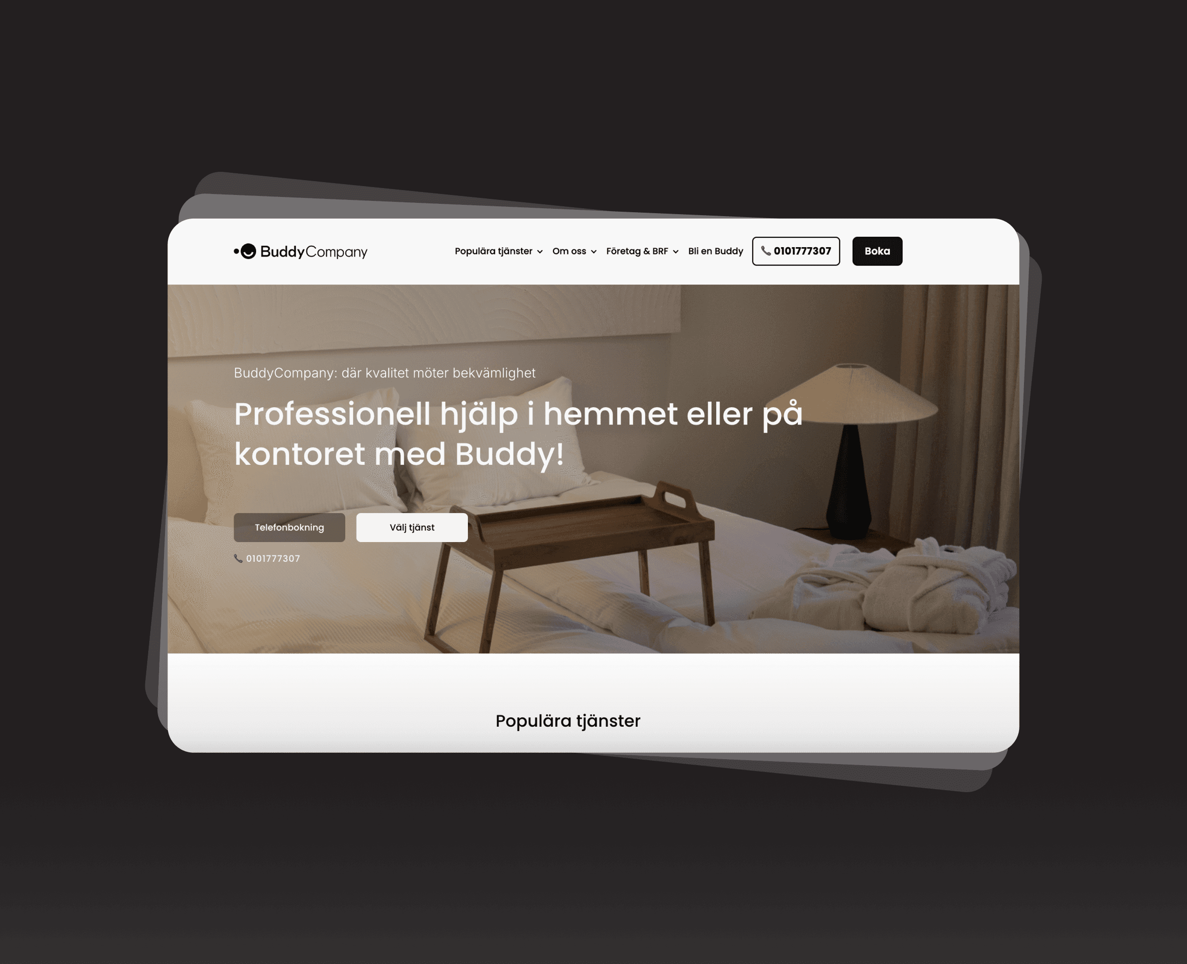
Mooova - BuddyCompany
Role
Product designer
Team
Cross-functional, including product owner,
stakeholders and developers
Mooova App design
Skills
UI/UX design | User Research | Accessibility | Prototyping | A/B Testing
Go to website

Project Overview
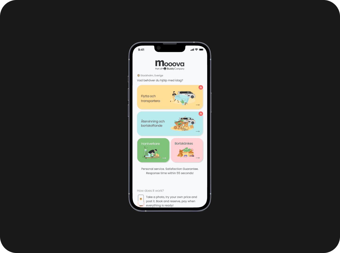
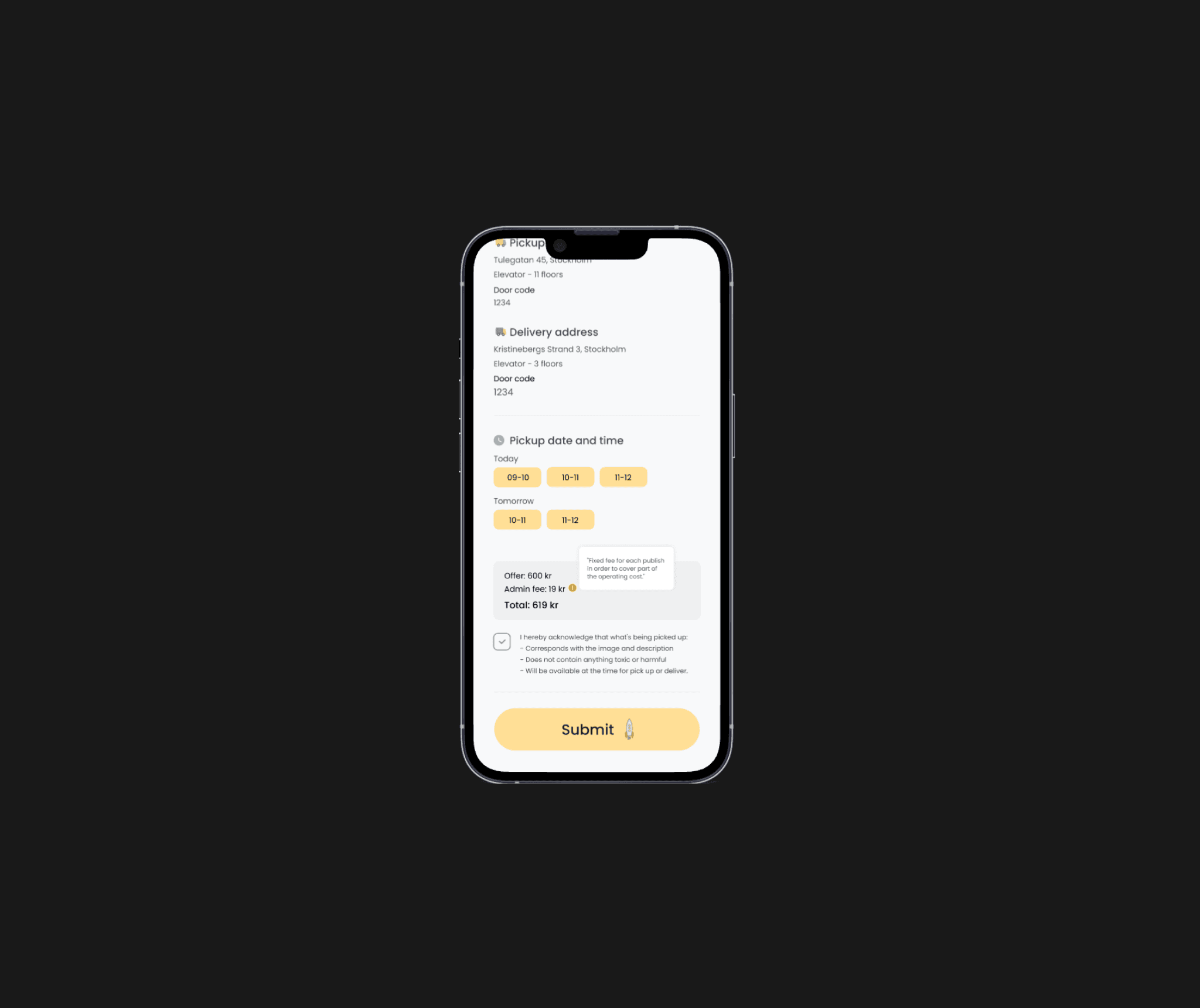
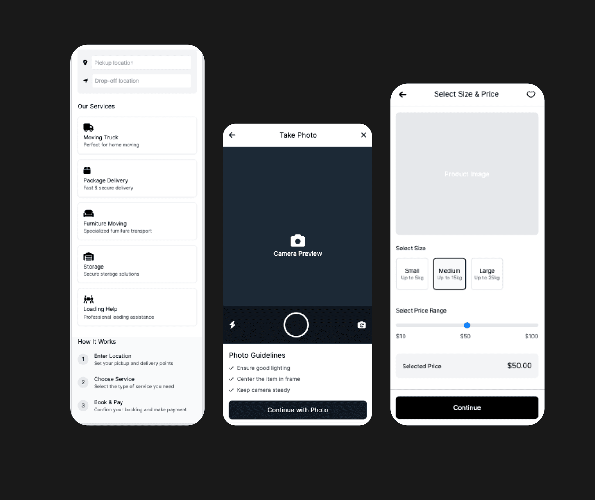
Mooova is a logistics platform that connects users with moving services, enabling them to book, manage, and track their moves. The goal was to design a new mobile application that simplifies the moving process, enhances user experience, and increases conversion rates. Goals - Design a user-friendly experience for booking and tracking moves - Minimize confusion around item sizing and transport types - Support both casual users and power users (frequent movers, business clients) - Ensure accessibility and ease of use across all devices Discovery Stakeholder Kickoff We started by aligning with business and tech stakeholders on the product vision, user types, and MVP goals. User Research I conducted interviews with: - Individuals who had recently moved - People who regularly use transport services - Customer support agents from BuddyCompany Key pain points identified: - Users often didn’t know how to describe the items they needed to move - Booking a vehicle without understanding capacity led to failed deliveries - People were unsure if pickup and dropoff addresses were required for every type of booking Define Using insights from research, we defined our core user flows: - Book a one-time move (single item or full load) - Choose vehicle based on size and need - Confirm pickup/dropoff details
Problem Statement
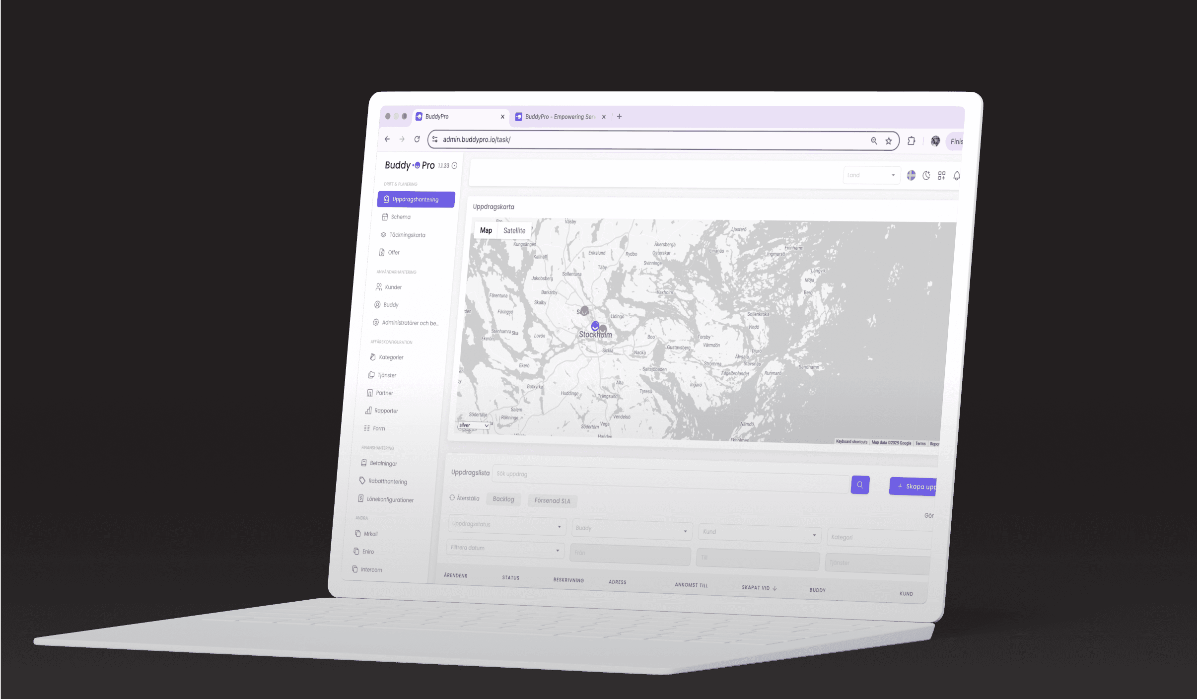
Traditional field service management involved extensive manual coordination, leading to inefficiencies, delays, and communication gaps between dispatchers and technicians. BuddyPro aimed to resolve these issues by providing a centralized platform where tasks could be managed end-to-end, from scheduling to completion. Key challenges included:
Ensuring Ease of Use for Field Technicians:
The platform needed to be intuitive for technicians with varying levels of digital literacy.
Optimizing Real-Time Communication: Enabling seamless communication and updates between field and office teams was essential to improve responsiveness.
Creating Customizable Reporting: Managers required a flexible reporting dashboard to monitor field metrics and performance indicators.
Goals
- Improve Task Discoverability Design an interface where users can easily browse and select relevant tasks based on time, location, and compensation.
- Simplify Navigation and Planning Provide both list and map views to support flexible task discovery and optimized routing.
- Enhance Task Clarity Make it easy to view key task details, including the type of service, distance, time slot, customer info, and description.
- Support Task Lifecycle Management Create interfaces for accepting/declining, starting, cancelling/rescheduling, and completing tasks, with reasons and notes.
- Facilitate Professional Documentation Enable Buddies to upload notes, photos, expenses, and mileage for accountability and support purposes.
Ideation
I ran collaborative sketching and ideation workshops

Prototyping & Testing
I conducted interviews with:
I created low- and high-fidelity prototypes and ran usability testing with 10 participants.
Key iterations:
Added a visual reference guide for item sizing (reduced confusion by 80%)
Made address inputs optional based on use-case (increased completion rate)
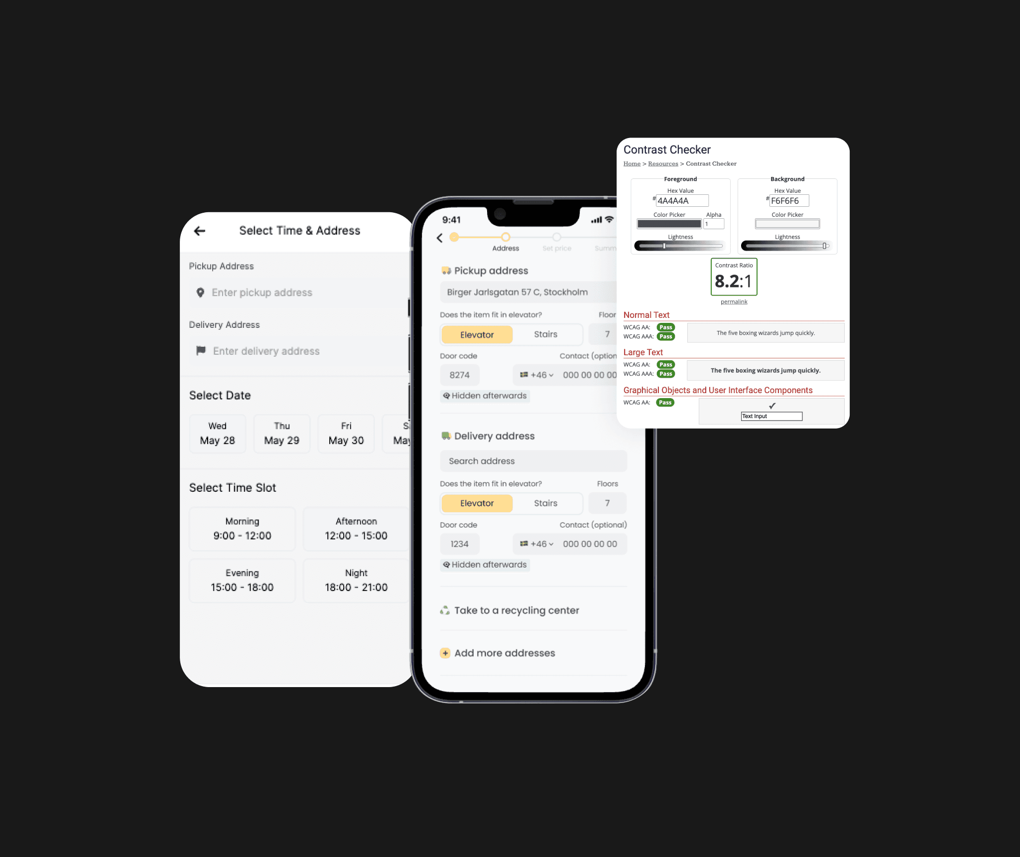
Improved contrast, spacing, and font size for accessibility
Introduced “smart help” tooltips throughout the booking process
Design System & Handoff:
Created a modular design system to support scalable development and future features.
Worked closely with developers to ensure handoff was smooth via:
Detailed specs in Figma
Interactive dev-ready components
QA collaboration in staging
Collaboration with Developers for Accessibility & Responsiveness:
Collaborating closely with developers, I ensured the platform was fully responsive for both mobile and desktop, meeting WCAG accessibility guidelines. Adjustments were made to improve color contrast, touch target sizes, and navigation to accommodate both the desktop dashboard and mobile needs of field technicians.
Testing & Iteration:
After completing the prototype, I led usability testing sessions with dispatchers and technicians to observe their interactions with the platform. Feedback helped identify areas for improvement, such as simplifying the task status update flow and refining notification alerts for critical tasks. Based on these insights, I iterated on the design to enhance clarity and reduce friction.